What is the source of the Apple Music Cover Flow rumours?
The current speculation regarding an Apple Music Cover Flow return stems from a viral Reddit post showcasing a new interface element. A user on the r/AppleMusic subreddit shared a video demonstrating an 'Albums' carousel on an artist page, which triggers a visual transition reminiscent of the classic Cover Flow style when interacting with album artwork.
While the specific mechanics of the interaction—whether it requires a tap or a long-press—remain unconfirmed, the visual language is undeniably different from the current flat design of the app. The user noted that the feature was 'referenced from code,' though it remains unclear if this discovery was made within a specific iOS developer beta or a standard production build. This distinction is critical, as code references often precede official feature rollouts in the Apple ecosystem.
However, the leaked interface is not a perfect replica of the original. Unlike the classic version, the observed design does not appear to feature a continuous stack of albums extending beyond the central artwork. It seems to occupy a much smaller portion of the overall user interface, suggesting a modernized, more subtle implementation rather than a full-scale return to the heavy 3D aesthetics of the mid-2000s.
Comparing the leaked UI to the original Cover Flow
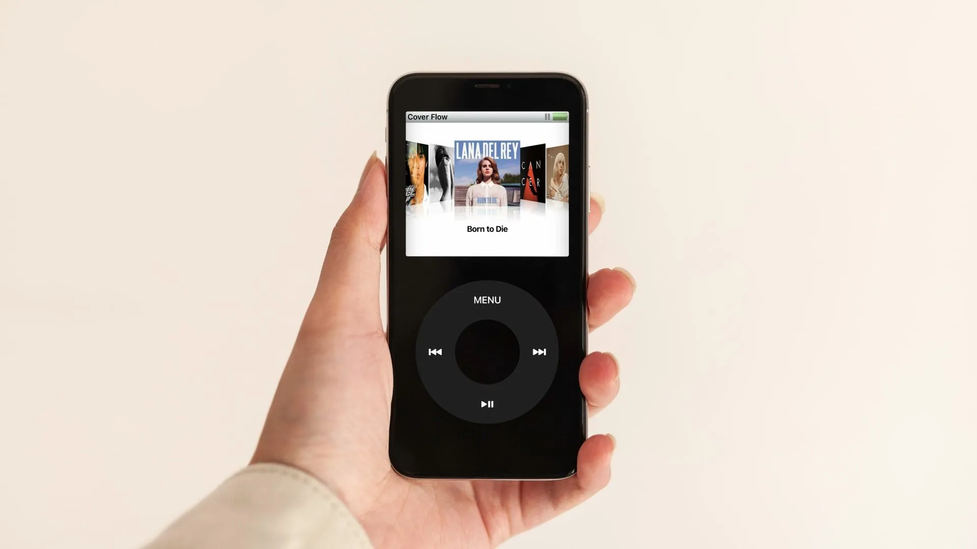
To understand the significance of this leak, one must compare it to the original experience. The classic Cover Flow allowed users to spin through a deep stack of albums in a 3D carousel, often utilizing the accelerometer of an iPod or iPhone to tilt the view. The current leak appears to be a more restrained, 2D or semi-3D carousel that focuses on a single selection rather than an infinite, tilting stack.
Why was the original Cover Flow so beloved by users?
Cover Flow became a defining characteristic of the Apple user experience during the era of iTunes and the iPod. It transformed the act of browsing music from a clinical list-based task into a tactile, visual experience that mimicked the physical sensation of flipping through a collection of LPs or CDs.
The design was celebrated for its simplicity and the 'fun' factor it added to digital music management. For many users, especially those who grew up with the 5th generation iPod Nano, Cover Flow was more than just a navigation tool; it was a way to interact with their musical identity. The ability to see large, high-resolution artwork in a sweeping motion provided a sense of depth that modern, minimalist 'flat' designs often lack.
Apple eventually integrated this interface into iOS, but the design language shifted significantly with the introduction of iOS 7. As the industry moved toward flatter, more efficient, and less resource-intensive interfaces, the heavy 3D rendering of Cover Flow was phased out. This transition marked the end of an era where the visual presentation of music was as important as the metadata itself.
How are users responding to the potential revival?
The reaction from the Apple Music community has been overwhelmingly positive, characterized by a deep sense of nostalgia. On platforms like Reddit, the leak has triggered a wave of excitement, with users expressing a desire for more 'soul' in their streaming interfaces.
One user commented that 'the listeners yearn for Cover Flow,' a sentiment echoed by many who feel that modern streaming apps have become too utilitarian. This craving for nostalgia is so strong that some community members have gone as far as creating their own concept designs, reimagining how a modern version of Cover Flow could integrate with current Apple Music aesthetics without feeling dated.
This reaction highlights a growing tension in software design: the balance between modern efficiency and emotional connection. While flat design is easier to navigate and scales better across different device sizes, it can often feel sterile. The potential return of a carousel-style interface suggests that Apple may be recognizing the value of adding 'personality' back into its core services.
What alternatives exist for those seeking a nostalgic UI?
Because the official return of Cover Flow is not yet a certainty, a market has emerged for third-party applications that attempt to replicate the experience. These apps cater to a niche but dedicated group of users who want their digital libraries to feel more physical.
One notable example is MD Vinyl, a popular music player and widget app. It allows users to sync their existing streaming subscriptions to display their music in an album stack that mimics the look of a vinyl record. While it provides the visual aesthetic, it operates as a layer on top of existing services rather than a native replacement for the Apple Music interface.
Another option mentioned in user circles is Soor, a specialized app that requires a one-time purchase of approximately $6.99 or £6.99. These third-party tools serve as a barometer for consumer demand; the fact that users are willing to pay for a visual skin proves that the desire for a more tactile music experience is a significant market driver.
The limitations of third-party nostalgia tools
Despite their popularity, these apps cannot fully replace the native experience. A third-party app lacks the deep system integration that Apple provides, meaning transitions may not be as smooth, and the interaction with the device's hardware (such as the gyroscope for tilting) may feel less organic. Furthermore, these apps often act as secondary players rather than the primary gateway to a user's entire library, limiting their utility for power users.
Key takeaways
- A Reddit leak has revealed a potential 'Albums' carousel in Apple Music that resembles the classic Cover Flow design.
- The leaked interface appears more modern and less complex than the original 3D stack used in the iPod era.
- User sentiment shows a strong desire for more tactile and nostalgic design elements in streaming platforms.
- Third-party apps like MD Vinyl and Soor currently exist to provide a similar visual experience for enthusiasts.
FAQ: Apple Music Cover Flow
Is Cover Flow officially returning to Apple Music?
There is currently no official confirmation from Apple regarding a Cover Flow revival. The rumors are based on user-discovered code and video leaks on Reddit, which suggest a new carousel-style interface is being tested, but Apple has not made a formal announcement.
What was the original Cover Flow interface?
Cover Flow was a visual interface used in iTunes and on iPod devices that allowed users to browse music by flipping through a 3D carousel of album covers. It provided a tactile, 'rolodex' style experience that became iconic during the mid-2000s.
Why do users want the old design back?
Users are seeking a sense of nostalgia and a more engaging, less 'flat' user experience. The original Cover Flow added a layer of personality and visual fun to music browsing that many feel is missing from modern, minimalist streaming interfaces.
Can I get a Cover Flow experience on my iPhone now?
Yes, through third-party applications such as MD Vinyl or Soor. These apps can sync with your streaming services to provide a more visual, album-stack aesthetic, though they do not replace the native Apple Music app interface.
Is the leaked design exactly like the old version?
No, the leaked design appears to be a modernized version. It seems to be a simpler carousel that does not include the deep, continuous 3D stack or the heavy tilting effects of the original interface used on older iPods.
Conclusion
The potential return of a Cover Flow-inspired interface marks a significant moment in the evolution of Apple Music's design language. While the leaked feature may be a simplified version of the original, its emergence suggests that Apple is listening to a community that values emotional resonance over pure minimalism. Whether this is a permanent design shift or a temporary experiment remains to be seen, but the widespread excitement confirms that in an era of infinite digital files, users still crave a tangible connection to their music.